Saturday, January 31, 2015

Illustrations using Adobe Illustrator

Purple Passion vine illustration using Adobe Illustrator


I have been illustrating in Adobe Illustrator for many years and after a many parts and end equipment I thought it was time to expand my subject matter. How I actually started working in the high-tech industry doing technical drawings and the occasional illustration was by showing an image of a green tree frog to a potential employer. It was the first attempt at illustrating using a PC-the program was Arts and Letters Jurassic Arts and the tools were basic at best.

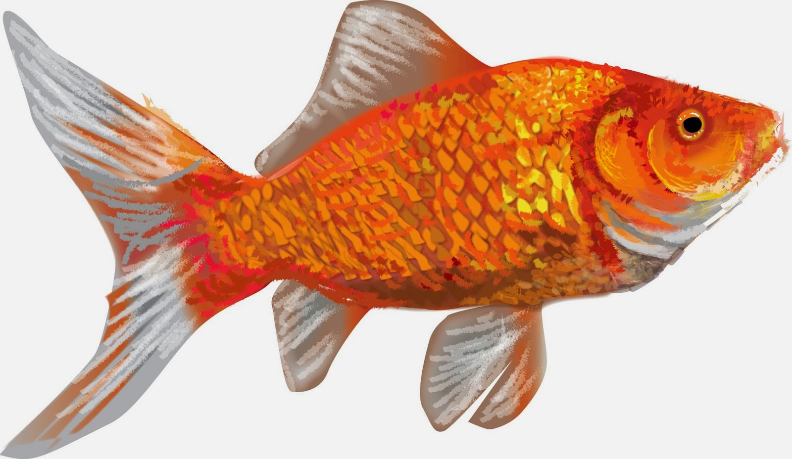
I have since worked in Micrografix Designer, Corel Draw even freehand and finally the standard adobe products-Illustrator and Photoshop. After writing about the life of a goldfish I decided to illustrate the image instead of using a photograph and what follows is how I approach illustrating in Illustrator.

My first and most basic process is just getting the shape and basic colors and tones down. This is the fastest part of the illustration. I will usually follow the lines of color and shadow and create layers of light that cover up layers of shadow. 

Image 1-basic form
After I feel the overall form is correct I will layer the colors again almost like the rings of a tree-you overlap each color with the form that overlaps it. You will notice every change and try to process it as if there were multiple layers of shapes that make the final form. I try to use as little gradients as they can tend to be contrived-if I do use them they need to be very subtle.
The second figure shows a minimal change from the first. Basic overlaying of colors that allow the background to show through and adds depth to the illustration. Detail is not as important at this point as there will be overlying of details and softening of edges after this stage.

Image 2-overlays of colors-layering for effect

The third step is where all the details begin taking shape. Again hard edges are overlapped
with lighter softer edges. At this stage I need to realize the overall texture and the best
way to create a subtle dimensional feel to the image. 

Image 3-overlaying two

By the third step the most intricate color and details become the major focus. I start cleaning up the basic shape and making sure all the proportions are right. The lines and detail is severe at this point because with the next step I will use the brush to merge the shapes to form a subtle more photographic image.

The final step is actually using brush strokes to overlap the hard edges of the previous step. Light and shadow overlay the original details and blocks of colors with varying degrees of opacity allows for more subtle effects.
Final step before creating background
After finalizing the details and colors of the fish I create a background. I don't want much detail in the background so brush work and simple heavily feathered images create a backdrop that strives to not fight with the image of the goldfish.

Finished product using Adobe Illustrator
Please stay tuned for more how-to articles on illustrating in Illustrator and rendering in Photoshop as well as processes for oil and pastel artwork. I welcome your comments, requests and suggestions.


Saturday, January 10, 2015

Back to the canvas 2


I painted a commission today, a painting of blackbirds and a still life, also a commission. Again, I don't feel like I'm one hundred percent back in the zone but I have a clearer vision of what I want going forward. I feel like I have worked hard at realism, relaxed and became a bit more expressionistic and now I am back to basic skill of capturing images correctly.

I'm not saying I want to be super realistic but I do want more quality in the initial rendering. I want the feeling to be the strongest element of the painting but I still want the details to be evident to the viewer. I am planning on doing more en plain air painting in the near future as I believe there are so many elements you miss when you paint from memory or pictures.

On that note, I tried to paint a still life without any initial layout. It really is a freeing feeling to just paint without any guides. The image is in my mind but it is not completely clear. It is an exciting feeling to watch it become out of just a vague idea of a painting.

I'm looking forward to continuing to allow more time to paint and as I increase frequency I will get back into the zone where painting just seems effortless.

Sunday, January 4, 2015

Back to the Canvas


I went into the studio again today, first time in a long time. I have many paintings to do for commissions and many that have just got on the to-do list. I was excited and yet awkward the way I always seem to be when getting back to it.

Very exciting feeling when all of the paintings you pick up you actually have a  clearer vision than when you first started. Today I revamped an evening fountain painting and completely changed the whole color scheme. I changed up a cloud scene with blackbirds and blocked in the flock of birds on a wire.

Preliminary Pastel Sketch
Pastel Preliminary Sketch
It was a good day, very productive-under painted several paintings that were to be commissions that have lagged behind for far too long. I had that feeling that I knew where things were supposed to be but I also have a whole new perspective on the movement of paint, the way colors weave into the canvas and my perspective in general.

I almost feel like it was a practice run. Nothing amazing except the realization how much I've missed painting and how incredible it feels to be in the creative zone. I look forward to the next sitting.

I'm not sure what's coming up next but the brake from painting seems to have helped. I am excited for the creative inspiration      
                                                             to grow. I will keep you posted.